A mobile application for Singapore's largest art supply store and the go-to art retail for artists.
MY ROLE
UX and UI Design
DURATION
November January 2022
For Google UX Professional Certificate
Although shopping retail is an enjoyable experience for the artists, the digital experience can be frustrating.
Artists looking for specific art equipment find it difficult to navigate the website and selecting their product takes too much time because of the variations of an art product, They find themselves walking away feeling that the shopping experience was not an user friendly one.
For instance, the user above had to go through a long list in order to reach the variation they want. There is a color filter option but when that was tested, the list generated turned out to still be long and led to a lengthy scroll time.
Objective
The design objective will focus on making the art products and its variations easier to find, select and shop for. In order to support that, there is a need to also incorporate Quality of Life (QoL) aspects into various parts of the user flow so as to create a product-searching process that is user-centric and is enjoyable for visitors.
Across the span of eight weeks, I conducted user interviews, usability testings, research, ideation, prototype and tested my way into a smoother and friendlier experience that targets the product-searching and selection experience of the app.
I started off by creating a sitemap to better understand the existing functionality and to analyze the user journey by which visitors have to navigate in order to access their desired art products. By doing this, it was made clear to me that the process can and will benefit from reduced complexity. This also helped in my consideration of the points in the user journey that will best benefit from QoL changes.

Information Hierarchy showing the general user flow from homepage to checkout, included is also other information make-ups on the site.
User interviews were conducted with artists, ranging from long time shoppers of Art Friend to relatively newer ones, asking them questions about the processes that they enjoy the most and the ones that frustrate them the most.
Based on the interview data, I summarized them into the major pain points below for the design to focus on:

In order to get a better understanding and to solidify the problems, I conducted a usability testing session with the group remotely and had them voice out their thoughts on each assigned task. The usability test have them complete the primary user flow on the Art Friend website, all the while voicing their thoughts and feelings throughout the process. This input was transcribed and compiled into a document, and was then used to create an affinity map and similar points were grouped to form themes.

Affinity Mapping was created after conducting Usability Testing for 5 users based on observations and transcription of the process.
Takeaways
The research has proven to be very beneficial in building more profound empathy for the artists using the website. From the user interviews and usability testing of the website, I narrowed down the focus into two key points which serve as the main takeaways.
1. Users have difficulty finding their desired product type because of the variations in one product, leading to long periods spent on the search results and product page.
2. Users see little need to use anything other than the search bar for navigation and the homepage does fail to draw interest to navigate otherwise.
With the design goals in mind, I started sketching ideas and created paper frameworks on how to meet the needs of the users. This lead me to annotate user flows and anticipate various pain points. I started out from the homepage with the goal of increasing its usability through categorizing the page's elements and sorting them by their importance to the user.
.png)
.png)
On the current homepage, the number of brands take up a large amount of space whereas the categorical groups of the products are small in comparison. Half of the brands that take up this space are also non-interactive elements and felt more like a directory than a homepage must-have. The sketches shows my thought process when deciding on how to best simplify the homepage without sacrificing too much of what's already on it.


During the sketches to generate ideas, I worked on 3 new opportunities for me to improve the user experience.
1. Product Selection
The product page needed a better system to sort the existing variations and I went through a brainstorming session of Crazy 8 in order to best simplify this process of a lengthy product selection. A different approach is required over a simple redesign as the current page suffers from listing out all the colors one by one, contributing to a prolonged list that requires a lot of scrolling time.
The filter option does help but it still leads to lengthy scrolling, there simply can be too many variations in a product. On mobile, there is nothing as intuitive as Ctrl+F for desktop, making this even more of an issue.

2. Filter Function
The current filter for Art Friend works like this:

The lack of visuals for quick identification have users resort to reading each of the filter choice. This is particularly time consuming and not exactly user friendly for filter lists as long as this. This is especially so if we consider users of filter are generally looking for a specific item without a full grasp of its name (whom can be new visitors or tourists). When considering the importance my targeted users have towards visuals and the lack of visual association here, I looked into whether introducing images for the filter is possible.

The filter group that is most suited for incorporating images is the group "category" as the imagery of art material is widely recognized by even your everyday layman. The hierarchy was also modified, putting category above brands.
3. Improving Engagement and Experience
When evaluating the product page, I realize there is a lack of information that could help users.
Similarly, during my research, I noticed that art friend stocks bundles and packages that were not advertised.


Ideation and decision making process when deciding on tab bar.
Low fidelity ideation for additional elements with short descriptions.
I wanted to introduce new elements to the product page to improve the engagement, and decided on the incorporation of three new aspects.
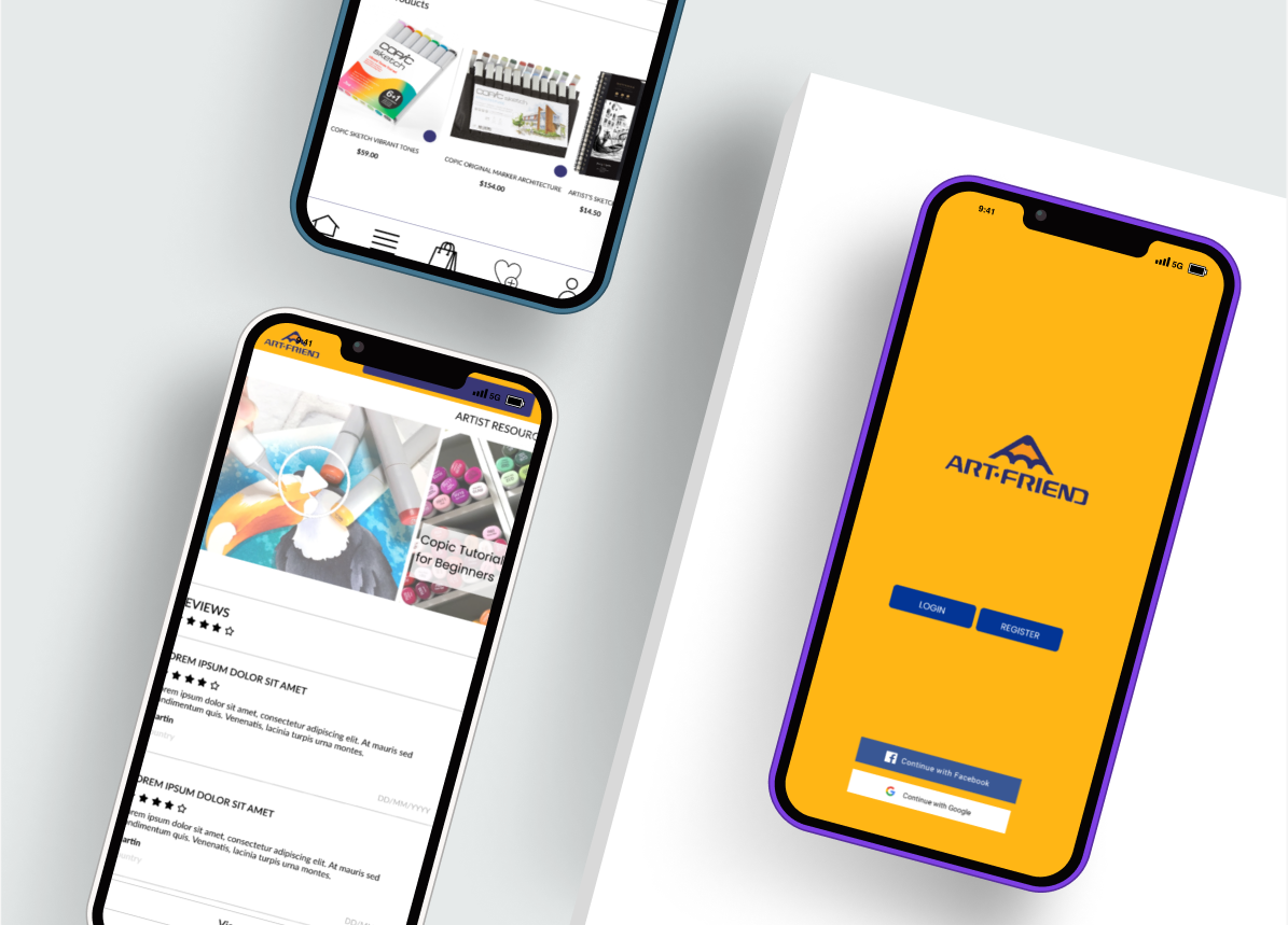
Firstly, I added a reviews section and added links to artist guides on the product page, this is followed by adding a way to navigate users to art bundles or packages (something long-term users can also benefit from) and introduced QoL changes such as Recently viewed. Finally, I created an navigation bar for the application with all the important navigation buttons.
With all that in mind, I designed the main user flow in low fidelity mode to guide the final product.

The current pages will be shown in comparison to the proposed designs for easier viewing.
We start off with the current homepage of Art Friend, accessed from Android on mobile-friendly mode.

Below is the redesign for the homepage in high fidelity after several iterations. I added elements based on what users are looking for which includes quality of life aspects. The focus here is increasing engagement and offering navigational start-points best suited for the artist.

I did the same for other pages of the main flow, working on important pages such as the filter page and the product selection page.


One of the glaring pain points was the long time it takes, when it comes to products with alot of variations, to find and add it to cart. I spent considerable time before deciding to rework the selection process through design while still keeping the page's integrity.

Through the buttons, users simply have to tap the groups that their colors fall under and an overlay where they can easily see the available options will pop up. You can watch how the design works below.
Color is the variable that led to a long list of products, and I used copic markers in this case because it is the art product that has the most color variation. When considering this design, I don't want it to be just something that only fits well for copic marker but to rather consider it from a one size fits all approach. To prove its effectiveness in use for other products, I tried applying the same design to other products (with color variations) such as oil paints, inks and color pencils.
The variation below is for the Daler Rowney Oil Pastel tubes that comes in different sizes, requiring me to workaround the different sizes (a second variable).

I conducted 1 round of usability testing for the current webpage and 2 for the application, with the 1st for the low fidelity and the 2nd for the latest high fidelity. The low fidelity was primary used to validate the usability of the new product page design but also to observe whether there is any frustrations in the user flow. The iterations and the high fidelity would then do its best to solve them.
Overall, the latest prototype garnered a 100% completion rate and a 90% positive experience rate, The testing for the high fidelity were met with positive reception, most users were surprised with the implementation and are interested to learn more. Others praised the cleaner aesthetics but pointed out some areas that could benefit from further development.


