

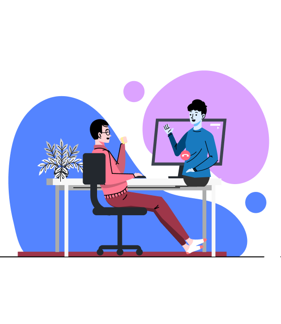
The world of online education has opened many doors for people globally and I am no exception after completing the Coursera's Google UX Course. I enjoyed the peer review system of Coursera but it felt lacking and as with all user experience students do, I had to ask the whys and come to observe that going through any worthwhile curriculum alone can be quite lonely an endeavor. Although I did come into contact with online users going through the same course, they never did come to the same closeness to be able to really call it a relationship.
The enrollment rate for online courses are also very high, yet the completion rate is not. Intrigued, I delved deeper in the reasons why people dropped out and wrote up the research portion of this study.
When my research is paired with the feelings that I have experienced going at it alone, and an understanding that there is so much more that people can learn, if they learn from each other, I decided on the purpose of this project: an education platform where you can be both the student and the mentor.

In Coursera, if you are looking for discussions, it will take three screens from the course page to reach the discussion forum in Coursera. Most posts are left unreplied with little to no interaction.
For instance, the only community aspect Skillshare has is the comments section, but the teacher has limited time to reply to every post on there. It is also common to see spam and offensive messages because of the lack of moderation.

Users who pick up courses tend to drop them because they are held back by the lack of support, uncertainty when transitioning into a new industry, and the feeling of loneliness in the process.
The presence of a community and the effectiveness of peer-to-peer learning can serve as a strong motivator for anyone picking up new skills. A huge part behind why classroom learning functions well is the environment that motivates and instill discipline is the learners. The challenge here is then, how do I incorporate that into the user journey of someone taking an online course?
With the service being online learning courses, I looked towards the most popular websites, and chose to use Udemy, Coursera and SkillShare. From there, I focused on their largest demographics.

From the data, the Young Adults (25-34) is followed by the Youth (18-24) as the largest age groups and closely behind is the Early Middle Aged (35-44) group. They are motivated to use online learning platforms to upskill themselves, seek new opportunities for growth and development, for a career purposes or to simply learn something new out of personal interest.
Based on the demographic data and with a need to better understand the users, I conducted a Focus Group with a group of 5, ranging from the age of 19 to 40, and who have at least tried one online education platform. The group consists of both university students and full-time working adults from different occupations who are considering to transit, or are currently transitioning, into a new industry.
The interview was guided with the following themes in mind:
1) Who are the main users of online courses and what are they like?
2) What motivates them to enroll in a course?
3) What motivates them to complete a course?
4) What deters them from completing a course?
5) How would having a community affect their learning process?
The actual interviews had more questions and elaborated answers, with sub-questions that goes deeper into the experience/ However, for the sake of a clear direction, the data was cleaned and grouped by themes into an affinity diagram:
The key insights from the affinity diagram shows that they worry about commitment when it comes to taking up new courses and that there is a shared sense of wanting to learn together with someone else but that is accompanied by the concern that there might be conflict or disappointment involved. The need for real life experiences that is relevant to the industry had also come up a few times during the session.
From the focus group findings, I summarized the information into 4 pain points to better guide the design approach.

I crafted two personas to better empathize with my users and guide my design approach. The idea is to have a persona that represents the young adults and another that represents established working adults so that the solution can best serve the main users of the learning platform.


Pairing users with someone who will serve as their mentor for that specific skill they are learning and who also have an affinity for their learning style is an idea that would be leagues better than waiting for an anonymous comment on a discussion board to answer their question.
The question that followed was what would incentivize the users to want to teach? With that in mind, I came up with the concept of CareerConnect.
To better convey the process that will make up the main experience, I storyboarded a key scenario.


Users would be paired up with another user, creating a mentor-student relationship. The user would have their course assignments reviewed by their mentor and be able to reach out and ask for questions or feedback during their learning. Following that, users would do the same by serving as the mentor for someone else and be given assignments to review along with the tools to communicate with their students.
Addressing the Mobile-first Approach
Before moving on to the rest of ideation, I have to talk about the elephant in the room. I prioritized convenience and ease-of-access over the traditional approach of "browser first, mobile app second" generally used. This is because established platforms would have their own mobile app that allows for on-the-go learning but lack the ability to make users feel like it is something engaging that they want to actively engage in, and are instead better described as just a copy of their browser site.

Although the term used was "mentor", I want the users to treat each other more as friends and the interaction through their mobile devices drives that feeling home, more than if they were to have to schedule timings and intentionally turn on your PC before finally being able to connect with the other user.
The counterargument would be that a messaging-like function (forums, comments) on the education app can already do that but that functionality exists as a byproduct of the learning process yet in this project's case, the interaction itself makes up the core of the process.
.png)
At the end of each module, there will be a need for the student to submit an assignment related to the module. The mentor will then review and decide whether the student satisfy the assignment completion criteria.

The initial idea was for someone in an experienced position to review the assignment of the student who is still learning but after consideration, an 1 on 1 review system is prone to biases and possible exploitations.
.png)
This is reduced through the use of a 3-person review system, where they are anonymous to one another and will have to review an assignment, with their cumulative scoring of it determining whether the student pass or not.
The student-mentor system works on the basis that there is enough mentors positions for students. However, if there is a bulk of them signing up for one course, such as software development, there could potentially be a lack of mentors to meet that. Hence, there needs to be a work about for such a situation. In the case when there are too many students, the students themselves can take on the role of mentors.
This works through a peer review system:

I used a horizontal timeline sketch to depict the peer review system. This idea was based on the user peer reviews process used by Coursera for some of their courses. However, that process is not without flaws as Coursera's peer review system works by having students review other students , even when they are at the same proficiency level.
It would be more effective and contributory to only have someone of a higher proficiency review the assignment, which was what was done here. In order for students to get their certifications, they have to complete a set amount of mentor(or peer) reviews, this ensures that there is always someone to review a submission at any given time.
Instead of using a linear learning method like most online courses, CareerConnect courses will use a roadmap that is similar to the .
In this case, the difference is that each roadmap can be modified by the users and their mentors for personalized learning.Front End Development Roadmap

Using Crazy Eight, I brainstormed how to turn widely used roadmaps into simple interfaces in the context of this project.
Implementing a roadmap that encourages choice changes the widely accepted linear online learning experience. However, one of the glaring pain point in this research challenge is that users want personalized learning, they want enjoyment and they want real-life appliances of their skills.
The purpose of having a mentor and a "choose your subject" approach is to have learning customized to the individual strengths. For instance, users learning to program might be stronger at certain coding languages and that build-up in confidence first would then allow them to better tackle other languages they are weaker at later.

The introduction of the roadmap introduces choice and elements of gamification. The roadmap can also be open for modification (from only verified mentors!) to add external sources or modules from other courses that they believe best cater to their students.
Learning will still follow a certain structure and people do still want a guide when using something new, but the point of a mentor and the use of the roadmap introduces flexibility and encourages exploration.
Below are the snapshots of other paper wireframes and ideas that helped my process, some which I dropped for the final version and some of which gave me new ideas. An instance was when I realize there should be a way for users to send selected portions of a class as a direct link which in turn allows for the user to communicate the exact parts of a lesson they have a problem with.

To understand how to design the core experience for the users, I created a user flow from onboarding to their first assignment. This allows for a big picture view and is important in communicating the enter and exit points for each process. I split them into three parts: the onboarding, the learning process, and the collaboration process.


I want the user to understand how the application works right at the beginning and that requires a simple introduction process that is both effective and engaging.
Users need to be able to understand the app from the get-go and see the product's MVP at work. The Onboarding flow contains the first part of the user journey, from registration to answering a set of questions in order to best find them a mentor that suits them.

The onboarding process asks what the user wants to learn, followed by answering what their occupation is before finally ending it with a set of questions that determines their commitment levels and learning style. Categorization questions would include but are not limited to, the following: their frequency of use per week, time commitment per session, current skill level, and the skill level they are looking to reach.

The process ends with the user being matched with a mentor that has the same learning style and commitment level based on their answers to the categorization questions. The user can choose to begin the interaction by sending a message or by viewing their profile before proceeding to the main user flow.

The process begins with the user selecting a course, going through the lessons, and eventually finishing their first assignment. Users want to quickly access and continue their courses so the courses page (with Recent Courses at the top) will always serve as the default homepage. The interface for the module selection was synthesized from the Crazy 8 process and drew inspiration from the language learning apps I experienced, such as Memrise and Duolingo. There is a lack of gamification in online course platforms despite gamification's ability to drive engagement, so I wanted to incorporate it into the process.

As a student, the user submits her assignment to be reviewed by her mentor. Before proceeding, she was advised to fulfill her mentor role and to review one of her student's assignments. done through either the dashboard or app bar. The dashboard is the Big Picture that lets the user access their list of socials (following and mentor list), shows progression and achievements, and provides quick access to her current and to-be reviewed assignments.
The assignment review asks for the mentor to access the attached files and answer a set of questions pertaining to the assignment. The mentor then decides whether their students meet the criteria through the use of a Likert scale depicted with emoticons. The first purpose of which is accessibility and the second is on the basis of encouragement, removing any association with the use of words such as "bad" "fair" "average", etc.

Users can host a Study Group session anytime during their journey, as long as they have access to other users, either as a peer or as a mentor. This functionality is made available during the submission and review process, as uncertainty regarding the assignment requirements (student side) or the submitted assignment (mentor side) is likely to happen here. The Study Group can be hosted anytime outside the Mentor-Student relationship to discuss the course content, collaborate on a project or just simply discuss ideas

My first attempt at the lecture pages lacked the mentoring aspect of the project. Therefore, I incorporated a special feature into the usual messaging design. Instead of the traditional method of pausing a video, noting down the part and remembering to bring it up to a teacher/mentor, the user can highlight the exact parts of the video through the transcript and send it to their mentors (or peers) to ask a question or for discussion. Instead of just "having" a mentor, I want the learning process to be built around their presence.


Whenever I sign up for online courses on Coursera or Udemy, I find myself losing interest but could never really pinpoint the reasons. Having been through and graduated from education institutes, the answer should have been apparent to me.
It feels easy to simplify the reason as we go to school solely for the certification, as if none of us graduated with fond memories of our peers. Late night projects and tight deadlines were barely achievable if not for the people around us. As adults and in a fast paced world, we barely have the luxury of sitting down and making meaningful relationships through learning.
This is my first UX project where I went through the entire process, from ideation to final prototyping to usability. I am immensely grateful for the experience and to have worked on something that I hold close to me.
What's Next
In its current stage, it still feels very much self-directed even with the features in place. There is still room to incorporate mentor-student elements into the process, with the key being to make it feel as seamless and engaging as possible.
Gamification exists to serve as a way to keep track of process but more could be done in terms of rewarding users with unique achievements and a point system could be looked into to exchange for something so that the learning feels earned.
The Real-life projects aspect was a desire that surfaced from the user research and while CareerConnect brings
real-life professions to each other, the red tape of actually working on and accessing real-life projects is still a myriad of puzzles that is waiting to be tackled.
What I've Learned
I started this re-design with the approach of wanting to feel comradery and have a community to connect with during my online learning process. With eventual research, that idea started to shift towards being truly convinced about the appeal of "learning while you teach" regarding any subject. When coupled that with the white paper research, it has really drove it into my mind how effective teaching can be as a method to learn.
I also learned the limitations of such an approach and that considerable time would be necessary to prepare, yet if an application does have the resources and the tools, it can reduce the overall time necessary given enough focus.


