

Project Overview
This case study was initially submitted as part of my Coursera UX Design Course with Google and has since then been expanded into a personal project over 80 hours due to my vested interest in wanting to better this passion project as best as I can.
This case study is a personal endeavor and is not associated with Chope in any way.
Chope Suggest is an add-on function to the original Chope reservation application and is designed to assist and shorten the time spent by social groups on the dining decision making process. It uses a choice based system and the extensive Chope database to pool together the needs and preferences of the group in order to suggest the best dining spot.

The question of “where to eat” or if not, “what to eat?” is one of the most common and recurring questions that we ask ourselves daily There is a certain joy to be found in the decision making process on our own but in social groups or when in relationships with a significant other, considerations towards the other party will come up that inevitably lead to time spent debilitating on a decision.
Research has shown that on average, people tend to spend 35 minutes thinking about what to eat on a daily basis.

This psychological phenomenon termed choice overload refers to the paradox of choice: customers want choice, just not too much.
This is an issue with dining apps that tend to be filled with promotions, sponsored listings, and featurettes which in turn led to the users being bombarded by choices, leading to decision paralysis. When you pair this fact up with the notion that there are now two or more people who are also considering the other party while having their own individual preferences, we can see how this does leads to prolonged time that could have been better spent.

Design a dining decision-making function to reduce the frustrations and time spent by young adults when deciding where to eat.
Audience
With the focus on Chope!, I decided to look towards the platform’s largest age group, which are young adults between 25-34 years old. They form the platform’s largest user demographic and have to go through “where-to-eat” decision making all the time and they are also the age group that generally have the largest and most active social circles.
Their main motivations includes finding a place that they like, a budget that they can work with, and to be able to walk away satisfied with their meals.
When dining out with others, they are concerned about whether the other party will enjoy the place as much as they did, whether their budget matches and whether they are comfortable with trying new places.
In order to validate my insights and gain deeper understanding into their concerns and motivations, I conducted a survey with 60 over respondents.

Through the survey, I compared what drives the respondents the most when making a decision on where to eat, what their important considerations are and the priority given to each factor in relation to the others. The data was then cleaned and sorted to form key insights that helps this study.
From the findings of the survey, I decided to probe deeper in order to form qualitative insights into why exactly an aspect was ranked higher in importance in consideration than the other. I prioritized validating the importance given to the top two ranked areas, which are: budget and the consideration of the favorites of others over their own.
In the same vein, I wanted to examine why the lowest importance was given towards suggesting someplace new and waiting time. What exactly was holding people back from their consideration of new places to dine and would the reason be something I can work with so as to better add value to the function?
The interview took place remotely and was conducted one on one with 5 respondents over the span of a week, with the focus on a better examination of the themes found in the initial survey.
Aside from the themes formed from the interview responses, I synthesized the relevant answers together into key statements to show why users choose not to prioritize suggesting someplace new and what would then affect their willingness to accept recommendations to do so. This helps guide what I could potentially do for the factors that were given lower importance.


Based on the user research, I crafted two personas to guide stronger empathy for the project. Each persona represent a different situation (one for dining with partners and the other for social groups) behind deliberating over food decisions. Both situations would be familiar or at least been experienced in some form by this project's targeted user group.

User Journey Map
From the user research and through the Personas, I crafted a User Journey Map that looks at a situation when Catherine, one of the personas, use the Chope app for their reservations. This situation is crafted around a problem, which is the indecision on where to eat, that leads to the use of Chope.

The How Might We questions were crafted so that ideation can be better guided and ideas are targeted towards solutions that best solve the HMW questions.


"Chope Suggest" Overview & Applicability
Chope Suggest functions just like its name: to suggest a food place that caters to all parties involved. What would usually be a session of discussion, of back and forth, considering each other's wants and needs would be simplified without the need to navigate difficult and lengthy discussions.
To meet the goal of simplifying “where to eat discussions”, Chope Suggest uses an interactive "choose your adventure" form that is filled by all participating diners. The diner will simply key in their preferences, budget, their willingness to try something new (or stay in their comfort zone!), their willingness to wait for long queue times and their preferred ambience and their special needs (food allergies, gluten-free, etc). This will be used to match with the preferences of the other diners and the design will best filter the places that are able to best meet all their needs.

I utilized user research data and referenced the How Might We Questions to sketch out the user flow and proceeded to come up with a list of questions which will allow for decisive information to be collected. The process has to be time efficient and engaging for the user, which is why the questions most important to them were prioritized and written with a casual and fun tone in mind. Additionally, for the questions to generate suitable results, I had to craft them to be precise and have created additional branches for further prompting when necessary.

Chope Suggest does not work in a vacuum and while can be for one person use, that is not its main purpose. The solution presented is a dining suggestion function that works best for two or more parties. This means that the function takes into account the choices of all the diners and each of them will have to go through the "choose your own adventure" styled form. I designed an activity diagram for one of the branching question, in order to demonstrate how it will function with a database and how the system can take into account more than one preference to generate an answer,


The low fidelity wireframes were created to map out, deliberate if anything is missing, and then to finalize the flow for high fidelity. Working on the low fidelity has helped me determine the placement of what goes where and assisted in the visual design decisions of the high fidelity prototype. One instance was how barebones it can feel when only 2-3 sentences fill the screen and did not came off as fun an interaction for the users, which mean that additional visual elements could benefit the screens.
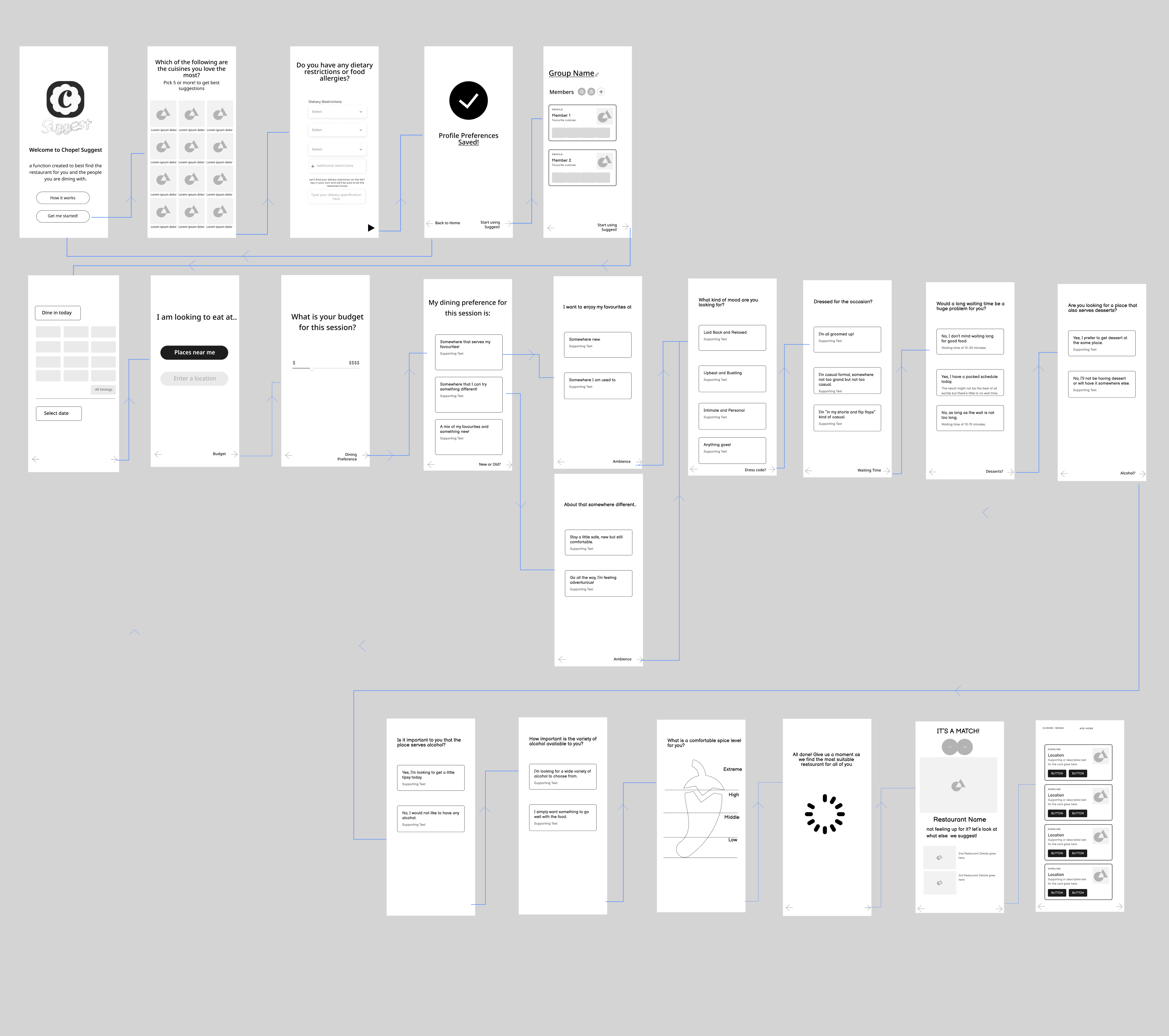


Chope Suggest can be conveniently accessed from the homepage. For first time users, they will need to select their favourite cuisines and dietary preferences. The choices will then be saved and be referred to when the user runs Chope Suggest. The favourites can also be changed anytime to introduce new or to edit current favourites.
Users will have to create a new group or select an existing one in order to fully utilize the features of Chope Suggest. When creating a new group, they will need to add members through their friend list or through other listed methods. The users in the group will have to participate in the orientation process and have chosen at least 5 of their favorite cuisine.

Chope Suggest pools together the preferences and choices of all the users in the dining group, before proceeding to search for the best suggestion to provide for the group that is able to meet all their needs. In order to do this, the function collects key information through a "choose your own adventure" style form.
Users start using Suggest from any of their dining group and will be prompted to select a time, their preferred location and to key in their price range for the session.


Further explanation for the process and each of the screens
The form, presented in a "choose your own adventure " interaction, starts here. The key was to keep the process short while gathering useful information that is important for the system to provide a suitable suggestion. Those considerations are whether they prefer to stick to their favorites or try something new, the ambience of the place, how willing are they to wait, dessert and alcohol preferences, and dress code. The current number of screens are still relatively short and there were more during the ideation phase, but my intention is to make the process a short and effective one.

Before a match to the dining place best suited for them can be generated, all users will need to go through their respective session. If not, the screen "Awaiting for all responses" will show up. Otherwise, the matching will begin and Chope Suggest will match with the one place that best suits their needs. From there, they can choose to book directly through Chope or choose to See more for other places that also matches their needs. Like with any other design and process, nothing is guaranteed to be perfect (although we can all try!) which is why when none of the suggested is selected, a pop-up will appear asking them what went wrong and how the app can do better.

Two usability testing sessions were conducted with 6 other peers + people who uses food dining apps frequently.
The improvements were made after the first and second testings based on observations and feedback.


This is my first time designing a function that works with another app. When I first crafted the Problem Statement, I knew that this has to work complementary to existing dining apps that has a large database of restaurants and that was Chope. With Chope, I enjoyed spending time researching about the application and the larger F&B reservation space. Outside of what I've learned about the F&B reservation business, the somewhat different nature of this project has also lead me to key learnings and takeaways that I am grateful for.
1. Insights is key - Although the explanation of the process can be important in teams, spending too much time on it can weight down the story that the case study is trying to tell. I believe that the audience should not be treated with a hand-holding approach and there should be little or no time spend on things that they should intuitively get. No one likes a storyteller that comes off as if they are better than their audience. I cut down quite abit of unnecessary text, largely to do with processes, that either felt like they detract from the purpose that is being convey or that they are too miniature to tell.
2. Research has to be purposeful - This mostly stem from my background in university days, where the focus is on deep dives and to always opt to spend more hours than what we feel is necessary towards a topic. That skill is still helpful and is not to be dismissed, but can become a problem when it comes to when to stop and what is important. Deep dives are great during the early periods where the direction is not as clear but can stall and detract from the intention of the case study if given too much time and taking a "trying to solve everything" approach.
3. Keep the focus on what's most important- Settling for and understanding that my project is not a tool that solves all but rather the tool that solves one problem effectively is an important trait to have. Although this was not as common as in my early days, it is still something that I have to be mindful for especially because I conducted two user research approaches during this project.
4. Usability testing where it matters - There is rarely the "best Usability test" but rather a series a usability testing that leads to the best use case outcome. But one must not forget the intention of each usability testing session. For this project, I conducted a total of 4 usability tests to ensure that each aspect of the function is designed with intention. But I had to made sure I did it at breakpoints where the focus of what I want the user to notice takes the center stage. Low fidelity prototypes allow for the users to focus solely on the questions and when additional elements (such as booking time and budget) was added later, having done the questions, they now turn towards the functionality and suitability of those aspects. In the same way, this approach is taken for the subsequent usability testing with the High fidelities.


